Establish zones in an open layout without relying on typical barriers, using changes in material, level, color and more
By Jen Dalley, Principal Architect at Parallel Lines & Former Houzz Contributor
Find the original article here.
Think of your favorite room. Imagine its textures, colors and openings. Picture all of the objects that sit in it. Now take the walls away. What's left? Does it still feel like a room? What elements are intact to distinguish it as a space?
Walls are arguably the easiest and most recognizable architectural elements that define a room. Let's stretch this notion and identify other ways to perceive space. Consider the following tips to create your home's spaces without relying on the typical vertical barrier for enclosure.
1. Level Change
There is no wall between this dining area and the adjacent space; a few steps differentiate the two areas. A level change can designate zones in an open plan and help to set up a hierarchy of spaces.
A level change can also define a smaller area within a larger room. A sunken living room like this creates a relaxed and cozy atmosphere.
The light wood flooring of this kitchen and the dark wood floor in the adjacent room merge on the steps and help the transition flow smoothly between the two spaces. Look up and you’ll notice that the ceiling changes in plane and material at the same point that the floor does.
2. Overhead Element
In this room there is a change in material at the ceiling level, while the flooring stays consistent. This material change is a smart visual way to delineate zones in a home with an open floor plan.
If you can’t make a material change in your space, try using paint for a dramatic effect. Keep the color consistent from ceiling to wall to headboard — here a crisp line defines the sleeping area from the nearby window.
For a cozy seating area, bring a portion of the ceiling down, as shown here. The color can stay consistent with this technique. Adding a few light fixtures further reinforces a change in scale and adds to the overall effect of this conversation zone.
Use a surprising element suspended from above to illustrate a change in space. This hovering fireplace cuts through the upper-floor void and brings the focal point back to a human scale on the lower level, which could otherwise have been lost in the double-height space.
3. Structural Elements
A home’s structural elements can be used to define space, too. These beams add another layer of architecture that is exposed in the vaulted ceiling.
In homes, exposed structural elements are typically reserved for the roof and floor framing. But how about using cross bracing in front of translucent walls, as shown here? Walls don't have to be solid and opaque.
Steel posts with steel channels that frame the edges make up this floating overhead canopy. The zone below doesn't rely on any full-height walls around it, so it feels protected yet open at the same time.
4. Screens
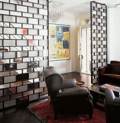
An easy way to add a privacy barrier near an entryway is to incorporate a room divider. This particular screen allows visual access to the front door with its transparent glass. The screen is a great way to create an architectural pause between here and the rest of the home.
Mixing a steel frame and wood blocks resulted in a warm and contemporary insertion between the living and dining rooms here.
5. Flooring Material
Warm wood contrasts nicely with the dark, cool flooring of the kitchen and is an instant visual cue to a room delineation. Notice how the ceiling changes in plane at the same line where the flooring changes.
Take the flooring up and transition it into the countertop for a more dimensional feeling, as shown in this compact kitchen. Get creative with your flooring material change to add character and vibrancy.
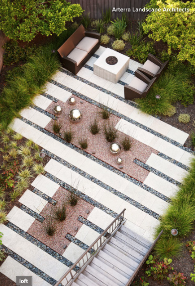
Defining a space without solid walls is best exhibited in a place with no walls at all! This patio relies on pavers versus landscaped areas to give it a sense of place.
Tell us: What techniques do you rely on to define zones in your home?


